Sunday 31 July 2016

what3words (2016)

There are a number of different ways to address specific locations on the surface of the Earth. Most of them are machine readable and require a great deal of expertise to both understand and remember.  

What3words is a new technology platform that directly addresses each and every 3 metre x 3 metre patch of the Earths surface using three words. 

The addressing scheme is not hierarchical so adjacent patches have completely unrelated addresses. For example, the address covertly.suave.charities and covertly.suave.deputy are in North-West England and the remoteness of the Yukon territory in Canada respectively. 

The approach is very clever and allows people who live in an otherwise difficult to describe location on the Earth's surface to be able to describe WHERE they live. It is language independent and because people only need to remember a short set of words rather than a 6 or 8 digit number it is very memorable. 

I have no doubt that within a few years a number of poets will realise that they can describe a journey between two places with the stream of what3words triplets that a person moves through. The phrases could form surprisingly melodious "found poetry".  I can certainly imagine a conceptual artist using a GPS to record the stream of what3words triplets that they experienced as they walked through Dublin following the route that Leoplold Bloom took in James Joyce's Ulysses! 

Below some what3words from one of my favourite locations in central london. 


 Image Copyright M.G. Reed 2016


Wednesday 20 July 2016

291 Art Journal (1915)

 The photographer and art promoter Alfred Stieglitz edited a journal called 291 that was published in 12 issues from 1915 to 1916. Scans of the volumes are available to download HERE

Below from Issue 9 the front cover by Braque.


Sunday 17 July 2016

Brushing the Past (2000)

HERE is a superb volume, Brushing the past : later Chinese calligraphy from the gift of Robert Hatfield Ellsworth  by Joseph Chang, Thomas Lawton and Stephen D. Allee. This is the catalogue from an exhibition held at the Freer Gallery of Art, Washington, D.C., Apr. 30, 2000-Jan. 2, 2001.

Below is a close up of a single character from a Qing dynasty couplet in running script by Jian Ren (1743-1795). The original calligraphy is on a pair of hanging scrolls in ink on gold flecked paper.

The full couplet that this character is taken from reads:

Ten meters around, dragon bamboo stands taller than the trees,
In five colors each, sacred mushrooms blossom as big as a fist.


Saturday 16 July 2016

Carcinogenesis

About 25 years ago, I was lucky enough to read in proof copy a book by the cancer biologists Anna Soto and Carlos Sonnenschein called The Society of Cells. In this book, the authors outlined a theory of carcinogenesis (Tissue Organisation Field Theory - TOFT) that was antithetical to the very commonly adopted theory of carcinogenesis known as the Somatic Mutation Theory.  As a neutral (and ignorant) non-biologist it looked to me that the evidence that Sonnenschein and Soto presented supported their theory and that it had some features that made it more attractive than the then dominant one.

Every now and then I try and find out what happened to TOFT and how it is faring against the Somatic Mutation Theory. One of the things that strikes me is that in a field as hellishly complex as cancer biology it is highly unlikely that a full understanding will emerge quickly. If we take as a yardstick the development of physics, from the publication of Newton's Principia in 1687 to the recent and outstanding example of a theory led observational study such as LIGO (Laser Interferometer Gravitational-Wave Observatory), we see 350 years of development of a science by a huge number of incredibly clever people. I assume that we might reasonably expect a full elucidation of cancer to take at least as long. This estimate is a balance of two factors. We would expect that understanding cancer should be quicker due to the application of modern measurement and computing technology. But we should also expect it to be slower because biology does not enjoy the incomparable advantage that physics has of being built on a small number of mathematically tractable and universal laws. 

To help others who are as ignorant of biology as me HERE is a thought provoking personal piece by Prof Robert Weinberg in the journal Cell that describes a story of nearly a hundred years of cancer research. The abstract reads:
Cell has celebrated the powers of reductionist molecular biology and its major successes for four decades. Those who have participated in cancer research during this period have witnessed wild fluctuations from times where endless inexplicable phenomenology reigned supreme to periods of reductionist triumphalism and, in recent years, to a move back to confronting the endless complexity of this disease. 
This paper describes some of the recent history of how cancer research developed, particularly in the US, and a number of frank admissions about current difficulties that mainstream cancer research faces. These lead me to suppose that a full and robust understanding of how cancer develops (to the same level of rigour of LIGO) is still quite some decades away (Weinberg uses the word endless twice in his abstract)  - for example: 
The data that we now generate overwhelm our abilities of interpretation, and the attempts of the new discipline of ‘‘systems biology’’ to address this shortfall have to date produced few insights into cancer biology beyond those revealed by simple, home-grown intuition. The coupling between observational data and biological insight is frayed if not broken.

We lack the conceptual paradigms and computational strategies for dealing with this complexity. And equally painful, we don’t know how to integrate individual data sets, such as those deriving from cancer genome analyses, with other, equally important data sets, such as proteomics. This is most frustrating, since it is becoming increasingly apparent that a precise and truly useful understanding of the behavior of individual cancer cells and the tumors that they form will only come once we are able to integrate and then distill these data.
For what it is worth, and I freely admit it is worth next to nothing, my money is on Soto and Sonnenschein's Tissue Organisation Field Theory of carcinogenesis - if only because they begin their explanation of cancer with the complexity of real tissues, rather than with an extreme form of probably misplaced reductionism. 


Aristotle to Zoos (1985)

Scientists who seek to explain their specialised area of knowledge to a wider audience run the risk of either dumbing down their exposition or peppering their prose with unexplained and arcane technical jargon. One outstanding example of a world class scientist who was able to explain his area of science in a pithy and engaging prose style was the brilliant Nobel prize winner Sir Peter Medawar (1915-1987).

My favourite example of Medawar's superb writing is his `philosophical dictionary of biology',  Aristotle to Zoos, which he co-authored with his wife Jean Medawar. Below is part of the entry on Hypothesis and Theory. 

 Text copyright Harvard University Press
 

Friday 15 July 2016

Hockney-Falco Thesis (2000)

HERE is a superb and up to date site describing the development of, and evidence for, the Hockney-Falco thesis propounded by David Hockney and Charles Falco.
The Hockney-Falco Thesis: Our thesis is that certain elements in certain paintings made as early as c 1430 were produced as a result of the artist using either concave mirrors or refractive lenses to project the images of objects illuminated by sunlight onto his board/canvas. The artist then traced some portions of the projected images, made sufficient marks to capture only the optical perspective of other portions, and altered or completely ignored yet other portions where the projections did not suit his artistic vision. As a result, these paintings are composites containing elements that are "eyeballed" along with ones that are "optics-based." Further, starting at the same time, the unique look of the projected image began to exert a strong influence on the appearance of other works even where optical projections had not been directly used as an aid. 
Below is a close-up from The Arnolfini Wedding by Jan van Eyck, painted in 1434. The detailed fore-shortening, shadowing and reflection of light captured in this image of a chandelier are all typical of an image that has been obtained via optical projection (probably with a concave mirror).


Travels with a donkey in the Cévennes (1888)

For my part, I travel not to go anywhere, but to go. I travel for travel's sake. The great affair is to move; to feel the needs and hitches of our life more clearly; to come down off this feather-bed of civilization, and find the globe granite underfoot and strewn with cutting flints. Alas, as we get up in life, and are more preoccupied with our affairs, even a holiday is a thing that must be worked for. To hold a pack upon a pack-saddle against a gale out of the freezing north is no high industry, but it is one that serves to occupy and compose the mind. And when the present is so exacting who can annoy himself about the future?


Frontispiece by Walter Crane from HERE

Thursday 14 July 2016

Taking the Proposition of the Beseiged Bastille


Image from HERE

The Open Door (1844)

Below is The Open Door by William Henry Fox Talbot from his book The Pencil of Nature. It is a classic Camera image. An image created by, or similar to, an optical projection seen within a camera - either captured by an artist within a camera obscura or captured chemically or electronically in a modern camera. These images have some typical features; often highly detailed, captured from a monocular position, frozen in time as if by a shutter mechanism, obey or approximate the laws of perspective, include shadowing due to strong directional lighting and foreshortening.

More on the creation of this image HERE by Prof Larry J Schaaf - part of the growing online William Henry Fox Talbot Catalogue Raisonné hosted by the Bodleian library at Oxford.

Wednesday 13 July 2016

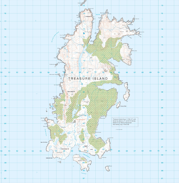
OS map of Robert Louis Stevenson's Treasure Island (2014)

Here is an Ordnance Survey map of Treasure Island. The inhabitants of the Shetland island of Unst claim that  it was the geography of their island that was the inspiration for Robert Louis Stevenson of his map of Treasure Island.The artist Tony Davis has taken digital mapping data of Unst and stripped out the modern locations and re-created a topographically detailed Treasure Island map. 

 Copyright Tony Davis. 
 

Tuesday 12 July 2016

Little White Bugs in a Shaft of Sunlight (2016)

In the early years of the 20th century, whilst working on Maxwell's equations and Einstein's theory of special relativity, the Polish-German mathematician Hermann Minkowski (1864-1909) found that it was necessary to meld together three Euclidian dimensions of space and one dimension of time to create a new four dimensional spacetime. (see Corry, L. (1997) `Hermann Minkowski and the postulate of relativity', Archive for History of Exact Sciences, 51(4), pp 273-314 for more background).  One of the concepts that Minkowski develops is that of a spacetime thread (also known as a world-line) - which maps out the x,y,z position of an element of matter over time. 

It is hard to imagine such a world-line, but the superb video of small insects flying in a shaft of sunlight in Rhode Island, is a good way of visualising how such a world-line develops. This was filmed by Dennis Hlynsky, a Professor and Dept Head of the Film/Animation/video Department at the Rhode Island School of Design. Recorded with the Black Magic pocket cinema camera in RAW, 29.9 fps 1920x1080 shutter 360 ISO200, Processed with Adobe After Effects CC. Full Video HERE.


 Image Copyright D. Hlynsky

Tuesday 5 July 2016

Cluster Failure and the Future of fMRI (2016)


All science is comparative - either comparing one thing to another, or one group to another (for example Treatment vs Control) or observations to a theory. Good quality quantitative studies require a numerical answer to the question Compared to What? 

HERE is a study by Anders Eklund, Thomas E. Nichols and Hans Knutsson that asks whether the statistical methods that are routinely used in tens of thousands of functional MRI (fMRI) studies around the world are any good. 

The authors provide a long, detailed and closely argued answer to this question. The short answer is NO.
 
The authors conclusions on the Future of fMRI are as follows.

It is not feasible to redo 40,000 fMRI studies, and lamentable archiving and data-sharing practices mean most could not be reanalyzed either. Considering that it is now possible to evaluate common statistical methods using real fMRI data, the fMRI community should, in our opinion, focus on validation of existing methods. The main drawback of a permutation test is the increase in computational complexity, as the group analysis needs to be repeated 1,000–10,000 times. However, this increased processing time is not a problem in practice, as for typical sample sizes a desktop computer can run a permutation test for neuroimaging data in less than a minute. Although we note that metaanalysis can play an important role in teasing apart false-positive findings from consistent results, that does not mitigate the need for accurate inferential tools that give valid results for each and every study. Finally, we point out the key role that data sharing played in this work and its impact in the future. Although our massive empirical study depended on shared data, it is disappointing that almost none of the published studies have shared their data, neither the original data nor even the 3D statistical maps. As no analysis method is perfect, and new problems and limitations will be certainly found in the future, we commend all authors to at least share their statistical results [e.g., via NeuroVault.org] and ideally the full data [e.g., via OpenfMRI.org]. Such shared data provide enormous opportunities for methodologists, but also the ability to revisit results when methods improve years later.
 

Monday 4 July 2016

Updated classification of Pictorial Representations

Now including both ABSTRACT and PATTERN at top level.


Copyright M.Reed 2016

Friday 1 July 2016

The Universal Map(s) - 2016

Well over a billion people regularly use either Google Maps or Apple Maps apps. The cartography used by the two platforms is surprisingly different and this essay gives a super detailed comparison of the differences. Below a direct comparison of the mapping of Central London by Google Maps (Left) and Apple Maps (Right).